After a significant project involving making Small Improvements responsive, we came up with some UI ‘rules’ that we in the design team or (‘UI Taskforce’) agreed upon. The longer we worked on this refactoring and ‘cleaning up’ of the app’s style, the more we realised the importance of (finally) having a Style Guide.

The UI Taskforce! Adrienne, Kristof, Kolja and Timur. (I took the photo).
At Small Improvements, we often have the front end developers implementing UIs faster than we (the design team) can keep up, so it’s important that they can access this guide.
A guide, a bible or documentation?
Given that we’re still a small team with plenty of feature-related projects on the go, I had a few concerns about taking on a project of this magnitude. There was fear of it becoming ‘half-finished’ project, something that gets outdated quickly, or even something that gets lost in technical implementation details. Out-of-date documentation is almost worse than no documentation. In considering the scope of this project (at least for the first iteration), I had to draw the line somewhere; Was this going to be simply a ‘guide’, or a definitive ‘UI bible’ with all the rules? How far would I take it and should we be creating Bootstrap-style documentation, complete with code snippets and workable examples? I also came across Lonely Planet’s awesome ‘Rizzo’ style guide, and felt very jealous they had the time (and resources) to do this, but hey… we’ll get there 
I decided to start with focusing on making a ‘User Interface Element Usage Guidelines‘ page, as these were the most important rules to communicate to the Front End developers. We still called it a Style Guide, as it rolls off the tongue a bit better – and that’s where we’re hoping to end up!
As is the case for most projects at Small Improvements, we took an iterative approach and started with a small MVP and plan to progressively improve it.
Gathering content, creating a skeleton
Before worrying about any implementation details, I wanted to focus on the content and structure of the Style Guide, so we would know the general direction in which it could grow. Starting with a Google doc, I wrote some basic sections and headings to create the ‘skeleton’ that we would later ‘flesh out’. For the first iteration, we’d only focus on a few certain areas of the skeleton.
What guided the decision process of choosing which areas to focus on was generally this question: “What new rules have we decided on, and are they implemented consistently across the app?”. Sadly, there have not been a whole lot of style aspects that fit into this category, but it’s also a good thing because it meant this skeleton only had a few parts that needed to be fleshed out right now.
The First Iteration (MVP)
- A one-page Style Guide with content flowing down the page
- Focused on
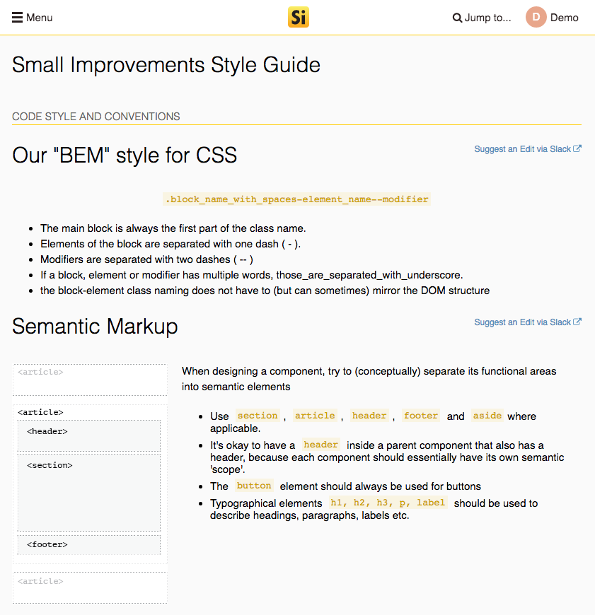
- User Interface Element Usage Guidelines
- Code Style and Concepts
- We won’t paste sample markup, we’ll focus on referencing the Angular and React component names.
Implementation
- We wanted the Style Guide to live as close to the app as possible – to be a ‘Living Style Guide’ and use real components. Thus, we implemented it as part of the Angular app. Longer-term, we might move it to the React world (which is where we’re heading) and experiment a bit with React Storybook too. But for now we’d keep it close to the Angular world.
- The Style Guide uses the same visual style as the app. Although in the app itself we don’t often lay out content in the same way (ie. long documents with multiple heading levels and sections), so there may be a few style-guide specific styles needed.
- We won’t really put code snippets in the Style Guide. Until we have a viable solution to render an actual component’s markup directly, we’ll just point the devs to the name of the component. After all, we all have access to the codebase.
- We’ll create Angular components for each section of the Style Guide and prefix them with sg- in order to follow the DRY principle as much as possible to keep it maintainable
- We started a Slack channel called #style-guide-feedback in which we can discuss new rules and how these would be added to the style guide
Conclusion and “Where it’s at”
Currently we’ve got the MVP done – and it’s being added to ongoing. There’s still plenty to improve with the layout, but the ‘skeleton’ is up there and able to be fleshed out as we go.
As a ‘UI Guy’, I’m really excited to have the Style Guide started and have a central place where we can really solidify our UI rules. I think the actual process of writing and documenting the Small Improvements style will help with creating a more consistent, sleek and polished UI.
Check it out: https://www.small-improvements.com/public-app/style-guide