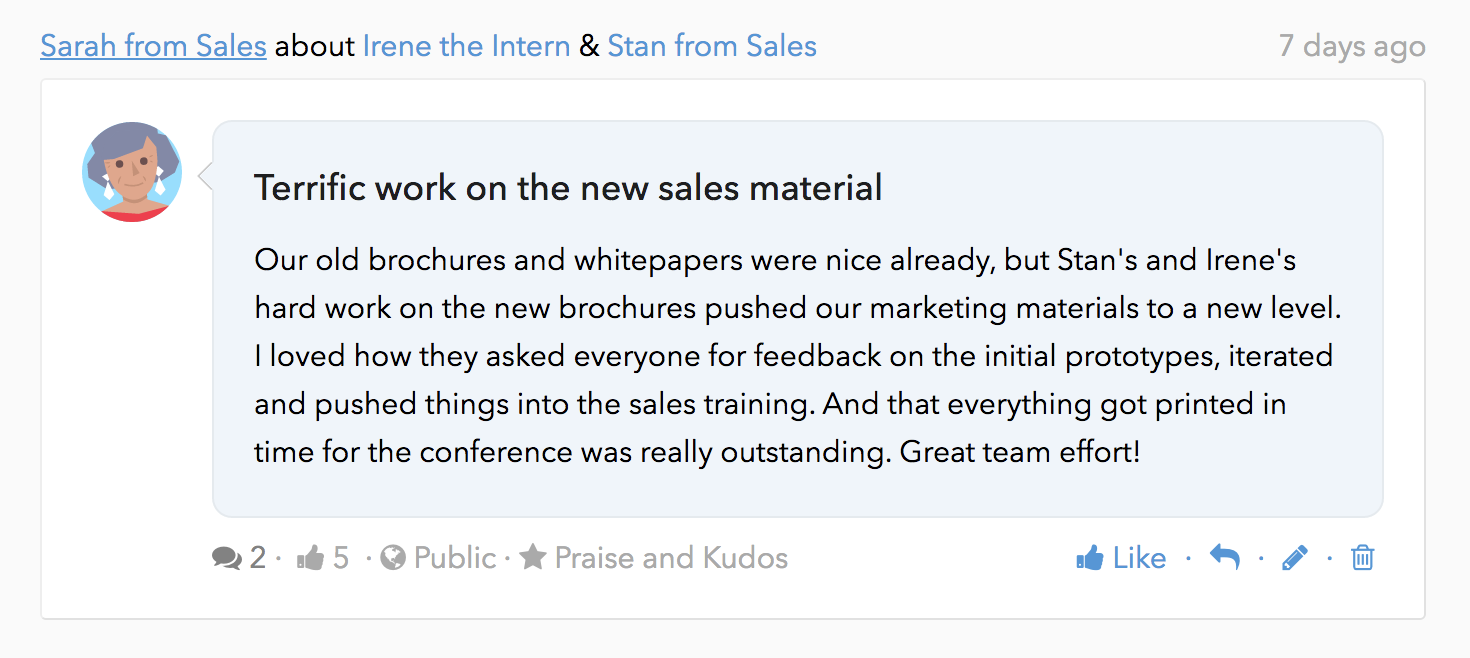
Today we’re excited to announce a new makeover for the Small Improvements application; a new font family! Please welcome “Avenir Next”!


Sample Objective within Small Improvements
This is all part of our mission to create a more enjoyable, engaging and enticing experience for Small Improvements users. The Design Team @ Small Improvements has had a big year; going responsive, updating colours, icons and badges, and now for the final Christmas treat, we’ve introduced the smart, the elegant, the distinguished style of Avenir Next.
Watching our Weight
Part of the new font release has also included making better use of font weights (eg. Regular vs. Bold) – giving you a clearer view of what’s important on the page, and making it easier to scan the page with your eyes to find the right things.
Keeping it Uniform
In the past, the default SI font varied across devices. That’s because we used ‘system fonts’ only, so some users had Helvetica, some Arial, some had which ever default ‘sans-serif’ font their device had.
Now all users will share the same experience across all devices.

Sample Message within Small Improvements – with new typography

